Visual Builder
The Visual Builder opens whenever you create a workflow or click one in My Workflows. It is a React Flow canvas: nodes are cards, edges are the lines between them, and data flows left to right along the edges.
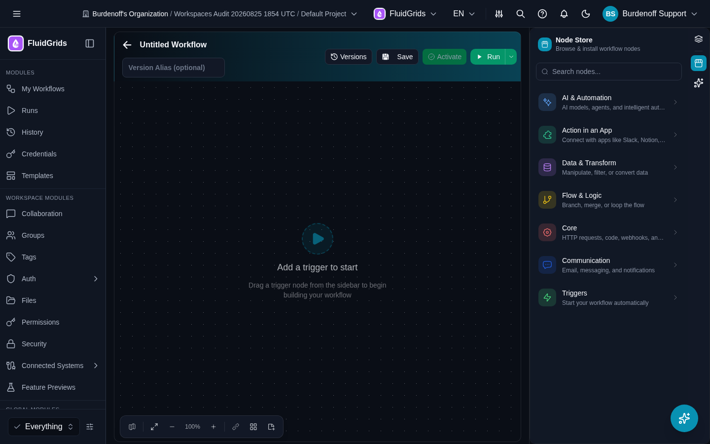
Layout
| Area | What it holds |
|---|---|
| Title bar | A back arrow to My Workflows, the workflow name (click to rename; new workflows start as Untitled Workflow), a Version Alias (optional) field, and the tag picker. |
| Toolbar | Versions, Save, Activate, Run (with a drop-down for run options), plus Share, Chat, and Templates. |
| Right rail | Icons that switch the right panel between Node Blocks, the Node Store, and the AI assistant. |
| Canvas | The graph. A new workflow shows Add a trigger to start. Pan by dragging the background, zoom with the wheel or the controls. |
| Canvas controls (bottom left) | Show/Hide minimap, Fit view, zoom out, the zoom percentage (Reset zoom to 100%), zoom in, Show/Hide connections, Tidy up layout, Add sticky note (Shift+S). |
| Logs panel | Bottom of the canvas. Streams the run when you click Run, with Input and Output tabs per node and a table view. |
On phones and tablets the same builder is used with a responsive layout; the panels open as sheets.
Adding nodes
There are three ways to add a node:
- The + handle. Hover a node's output handle and click Add next node. The Node Store opens in attach mode; the node you choose is created and wired to that handle. Cancel attach leaves the canvas unchanged.
- The Store button. Opens the Node Store (Browse & install workflow nodes) without a target. Drag a node onto the canvas, or drop it on an existing edge to insert it between two nodes.
- The Node Blocks panel. A searchable list with Built-in and Integrations headings, plus a Triggers section in the Available Nodes view. Drag from here onto the canvas.
The Node Store groups nodes into AI & Automation, Action in an App (Slack, Notion, Gmail, and the other services), Data & Transform, Flow & Logic, Core (HTTP requests, code, webhooks, logging), Communication, and Triggers. It shows every node available to the workspace. Store nodes that are not installed yet show an Install button (with a version picker); already-installed nodes show Installed, Update when a newer version exists, and Uninstall. Uninstalling a node that is still used warns you and lists the workflows that use it. Some store nodes are paid and must be purchased in the Marketplace first.
A store node with several operations (for example Gmail has 32) appears with one row per operation; drag the operation you want, so the node card lands already configured with that operation.
Configuring a node
Single-click a node to open the quick-configuration panel beside it. It shows the operation's parameters; changes apply instantly. Its footer reads Changes apply instantly · double-click the node for the full editor.
Double-click a node (or click Configure on the card) to open the full node editor:
- Parameters tab — every input of the selected operation. Each field can hold a fixed value or an expression; switch with the toggle next to the field. Expressions reference upstream data as
${output.<field>}. With no upstream node connected you can only set fixed values. - Settings tab — node-level settings such as retry and error behaviour where the node supports them.
- Input section — the fields the upstream node declares, so you can see what is available to map.
- Output section — the fields this operation returns, as JSON or Schema.
- Connections section — the connection (credential) this node will use. A store node with no connection shows a Credentials not configured warning on its card until you pick one. See Credentials.
Mapping data. In either editor, toggle the input mapper and drag a field from the upstream node's output onto a parameter; the parameter becomes an expression. Hovering an edge also exposes Mapper, which opens the GraphQL Mapper with a Visual Mapper, a JSON Editor, and a Preview, and supports Direct, Expression, Transform, Cast, Array, Object, and Context mappings.
Conditions on edges. Hovering an edge exposes Condition. The Condition Builder lets you add rules and groups, shows the generated condition, and can be edited as JSON.
Built-in node panels
Some built-in nodes have purpose-built panels instead of a plain parameter form:
| Node | Panel |
|---|---|
| IF | Condition Builder; True and False output handles |
| Switch | Routing rules checked top-down; each rule renders as an output handle, plus a Default handle |
| Loop | Source array, batch size, max iterations, continue on error; Loop and Done handles |
| Merge | Mode: Append, Combine, Multiplex, Keep Separate, Choose Branch; timeout and continue-on-timeout |
| Wait | Duration (ms, seconds, minutes, hours) or a specific Resume At time |
| Set | Values as JSON, with Keep Existing Data |
| Aggregate | Sum, Count, Average, Minimum, Maximum, First, Last, Concatenate; field and optional group-by |
| Subworkflow | Target workflow, optional version, input/output mapping, wait for completion, timeout, fail on error |
| Code | A code editor for JavaScript or Python |
| Schedule Trigger | Cron expression or interval, with day-of-week selection |
| Webhook Trigger | Shows the workflow's Webhook URL once the workflow has been saved |
| BigConsole DataSink | A single DataSink Key; the BigConsole connection is handled automatically |
Sticky notes
Add sticky note (Shift+S) drops a resizable note on the canvas. Notes support Markdown (headings, lists, links) and can be edited, duplicated, and deleted. They are saved with the workflow and are ignored at run time.
Node card indicators
Each card shows its name, the selected Operation, and its last run status. Execute step runs just that node. The Credentials not configured icon means a connection is missing. Nodes that failed on the last run are highlighted.
Saving
Save validates first. The flow is rejected as Flow is invalid when a node is not connected or the graph does not start at a trigger — fix the highlighted node and save again. Every successful save creates a new version of the workflow; the previous versions stay in the Versions panel. Saving never changes which version is Active. See Workflows.
If saving fails with Workflow Limit Reached, your plan's workflow quota is used up. See Plans and Quotas.
Running
Run validates, then starts an execution of the version on the canvas and streams it into the Logs panel. Runs started from the builder go through the manual trigger. To see the run alongside all others, open Runs.
Activate
Activate in the toolbar makes the version on the canvas the Active one — the version that webhooks, schedules, and the other automatic triggers execute. It is disabled until the workflow has been saved. Activating from the Versions panel does the same for any older version.
Versions
Versions opens the Version History panel for this workflow. Each version shows its number, optional alias, status (Draft, Active, Deprecated, Archived) and a Current badge for the one on the canvas. Actions per version:
- Activate this version — makes it the one webhooks, schedules and other automatic triggers execute
- View in builder
- Restore as new draft — copies an old version into a fresh draft
- Delete version — removes it permanently; other versions and their triggers are unaffected
Chat
Chat opens a panel for testing conversational AI workflows: type a message, the workflow runs through the manual trigger with the message as input, and the reply appears in the panel. Clear chat resets the thread.
Share
Share opens the same dialog as on the workflow card: Share Link (read-only public link) and Embed (iframe code). See My Workflows.
Templates
Templates in the toolbar opens the template gallery in a dialog so you can start a new workflow from a template without leaving the builder. See Templates.